Welcome to Book Design 101 – a handy guide covering all the basics of what you need to know when publishing your first book. In this episode, we’ll look at some basic printing terms that you might want to know to understand what your designer and printer are talking about!
Basic printing terms
The printing world tends to use anglicized terms in all languages I work with, with some variations – which is why, in contrast to the previous articles from the Book Design 101 series (for example: The Anatomy of a (Book) Cover), I’m not including an ENG/PL/NO dictionary at the end of this post. Instead, look for translations under relevant subheadings!
CMYK/RGB colour space
Images can have different colour spaces – most of the images you look at on screens are in a colour space called RGB (which stands for Red, Green, Blue). Unfortunately, RGB covers a wider range of hues and shades than what can be achieved in print – the printed colours are often not as vibrant. That’s where CMYK (Cyan, Magenta, Yellow, blacK), which is the colour space used in print, comes in. All the images in your book need to be converted to CMYK to be printed accurately.

DPI & image resolution
🇵🇱 rozdzielczośc 🇳🇴 bildeoppløsning
DPI stands for Dots Per Inch (you might also encounter PPI, which means Pixels Per Inch – same thing). This term literally refers to the number of ink droplets a printer will produce per inch while printing an image. The DPI value determines the resolution of an image – if it’s too low, the printed version will be blurry, pixelated, and generally of low quality. For printing books, magazines, and similar publications the minimum DPI is 300.
4/4, 4/0, 4/1…
Did your printer ask you if your cover should be 4/4 or 4/0? Fear not – these terms refer to the amount of CMYK colours used on the outside and inside of the cover. If your cover is 4/0, you’re printing only on the outside, using all four colours (meaning, not in black and white only); if it’s 4/4, you’re printing also on the inside of the cover.
Digital vs offset printing
One of the decisions you’re going to have to make when publishing your book is deciding on a distribution model, which often determines whether it will be more cost-effective to use digital or offset printing. Digital is used often by Print on Demand platforms like KDP or IngramSpark – it’s much cheaper when you’re printing individual books or small amounts of them, but gets really expensive if you want to print a bigger run. In comparison, if you want to print several hundred of more copies at once, the cost will be much lower per book if you choose to go with offset.
Bleed
🇵🇱 spady 🇳🇴 utfallende
If you’d like your illustrations to cover the whole page, without a white frame at the edges, they need to be actually a little bit bigger than the page itself – usually by around 3 mm / 0.125”. The surplus will be cut off during printing. Same goes for the cover, but in this case the bleed may be bigger depending on the format – with hardcover, it can be anything between 15 and 20 mm.

Embossing, debossing, foiling…
…and all the other terms referring to special printing effects, which are available if you decide to print via a regular printing company (PoD usually doesn’t offer anything besides a matte/glossy cover lamination). There are too many of them for this article, but here’s another one where I describe them in more detail: Printing Effects.
Proofing
After you send files to your printer, you will usually receive a digital proof – which is a low resolution copy of your cover and interior files, with all the printer’s marks, which you can use to check the colours and take one last look at everything to ensure there are no mistakes and typos.
In some cases, you can request a hard proof, which is a paper copy of the cover and several spreads of the interior, printed on one big sheet of paper. Keep in mind, though, that it’s a process that costs extra. If you’re using PoD, you can simply order a single copy of your entire book, but that is possible only with digital printing – with offset, it’s way too expensive to print individual copies and most printers won’t agree to produce only one book.
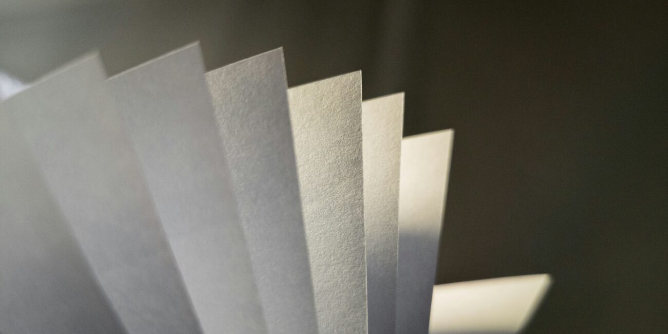
GSM
When choosing the details of the interior of your book, you will run into terms describing paper weight – which is often expressed in GSM (grams per square meter) or in lbs (pounds).
Most novels will be printed on 60-90 GSM paper (which is equal to 50-60 lbs). Children’s books and other publications with a lot of illustrations usually use thicker paper – between 100-130 GSM (which is equal to 65-90 lbs).

That’s it!
I hope you found this short article useful – let me know if you think it’s lacking something, or if you have an additional question.
I’m always up for a chat – get in touch via marta@martadec.eu.