
In every first-time author’s life there comes a moment when someone – or a self-publishing platform’s interface – asks a very important question: what kind of paper would you like to use for y
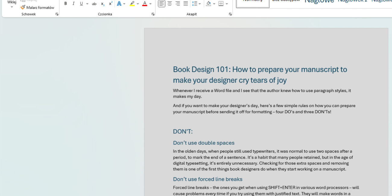
If you want to make your designer’s day, here’s a few simple rules on how you can prepare your manuscript before sending it off for formatting – four DO’s and three DON’Ts!

How to make sure that your EPUB meets the accessibility criteria? And what does accessiblity even mean?